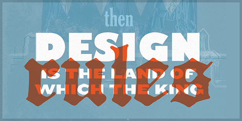
Last week we publish an article titled “If Content is Really King, Then What Is Design?” Not only did this article inspire a ‘Self-Expression Fridays‘ poster design, but it also had me thinking: If content is king, what can the design do to compliment the “king,” or in this articles case, the content?
If what you have to say on your website is so important, then what can we do to make it a more enjoyable experience and better complement the content with the way we design for it?
Appropriate typefaces
Typography is not about picking a font that looks cool, but rather choosing a typeface(s) that compliment the medium and purpose. With recent advances in web typography (ahem, Typekit) we now have more control then ever over what typefaces we use for our content — but with more control, we must be even more careful and have a better understanding of type.
Web typography tips:
» When choosing a font for prolonged reading, try something with a larger x-height (for smaller body copy) or study serifs for improved readability and reader comfort.
» Choose typefaces that compliment the content, look and layout
For more on font pairing and web typography you can search these terms:
On Web Typography
Thirteen ways of looking at a typeface
Type inspired interfaces
Breathing room
Websites or blogs with tons of reading require breathing room — or better yet, remember that white space is your friend. It’s difficult to read and stay focused on any information that is, for example, being crammed up against ads, has tight line spacing, or has cluttered design elements.
Don’t worry, it’s alright for users to scroll vertically to get to information. Don’t feel like you need to cram it all in there.
Here are a few design tips to help your content breathe:
» Improve your line spacing of body copy: a good rule of thumb is 1.5 em line-spacing of your body copy font size.
» Remember, white space is good and less is more
Establish an information hierarchy
When it comes to readable content, one thing to remember is people do not like to read — they like to scan and get the information they want quickly. Establishing a strong hierarchy allows the reader to easily scan your website, blog, article, etc. for information without spending too much time on information they do not want to see or read.
A hierarchy guides your readers around the page and creates a more enjoyable experience for them.
Allow for digestible information
If your website or blog has length passages of information or words, try designing in a way that breaks up the content into smaller, digestible blocks of text. A possible solution could be having a home page with short excerpts of articles/information that lead to the entire story by clicking on a link.
Use color and use it well
Color should not only be used to create a mood, but also to draw attention to specific areas or text. Websites that use color sparingly and well typically have great results because of it. It helps readers scan and draws attention to important information.
A few tips on color usage on the web:
» Reversed out (white) text on dark backgrounds can make for difficult, prolonged reading.
» Using too many colors can distract the user and can cause confusion over important content/information
» Use color to communicate a mood
Contrast and call to action
Contrast and call to action allows information to be broken apart and also (like a good hierarchy) easily scan-able. Contrast can be used in typefaces as to separate headlines from body copy, while it can also create areas of darker/brighter color to draw attention or call upon a certain area of your screen.
Contrast can also be used to create tension and set a mood for the content. Try complimenting your content with appropriate typefaces or color. Also note that establishing call to actions early on in the sites preliminary stages is important content management and structures the users experience.
While all of the above factors seem simple in practice, it is often easy to just begin designing and forget about the content and medium in which we are designing for. Remember, content is king, but design is the land of which the king rules. If you have the above thought out and planned before you start designing it will pave the way to a more successful and relevant design.
